
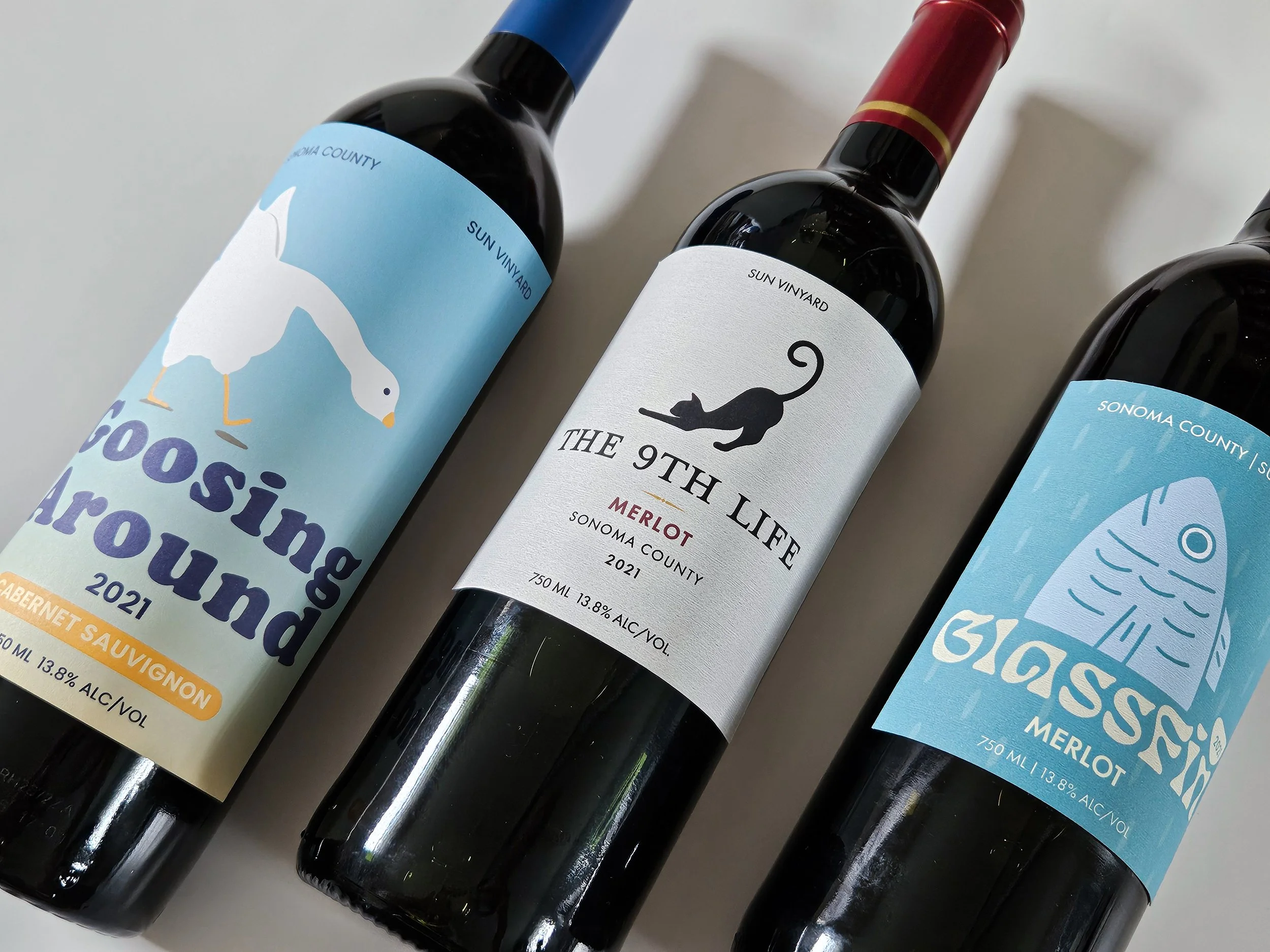
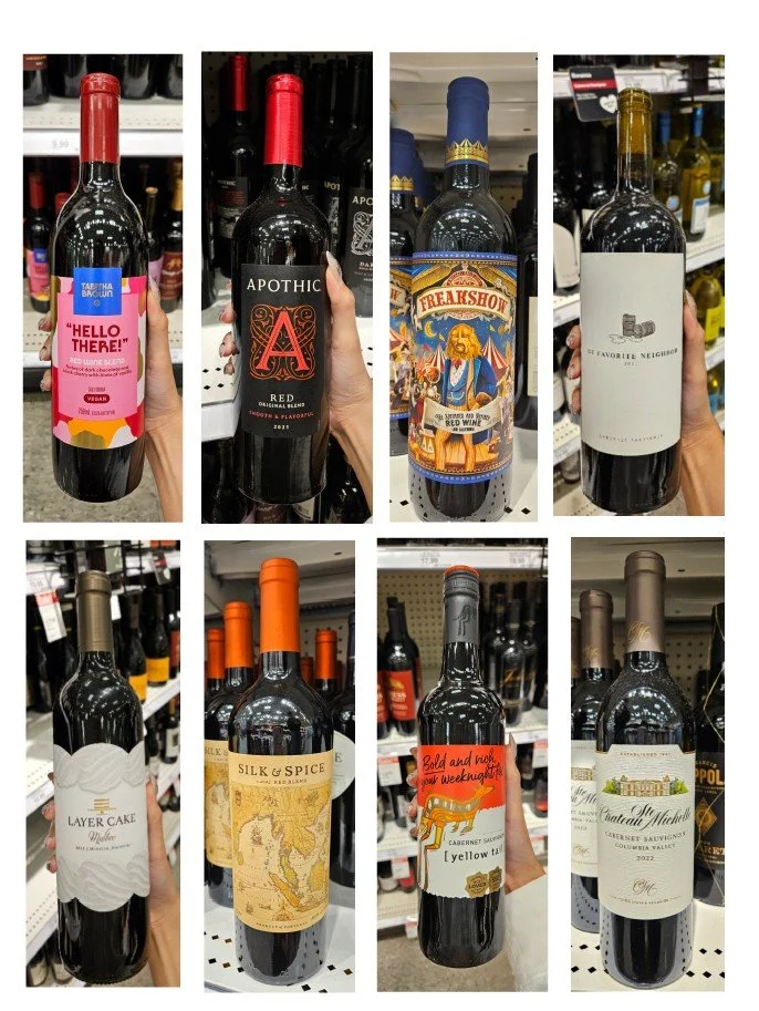
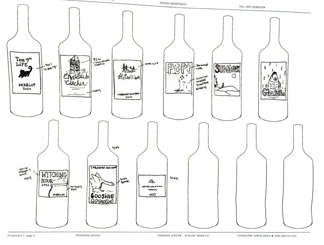
Three Wines, Three Moods is a wine label series designed to reflect different market tiers and occasions, ranging from casual gatherings to more refined experiences.
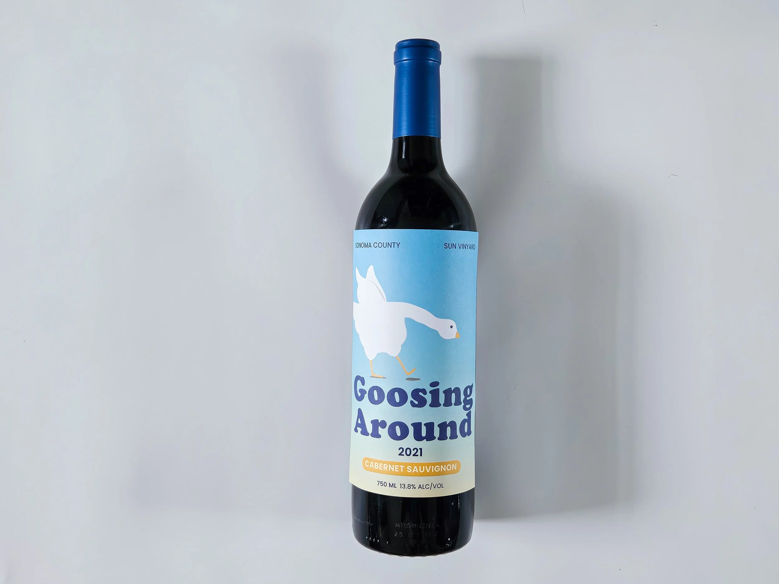
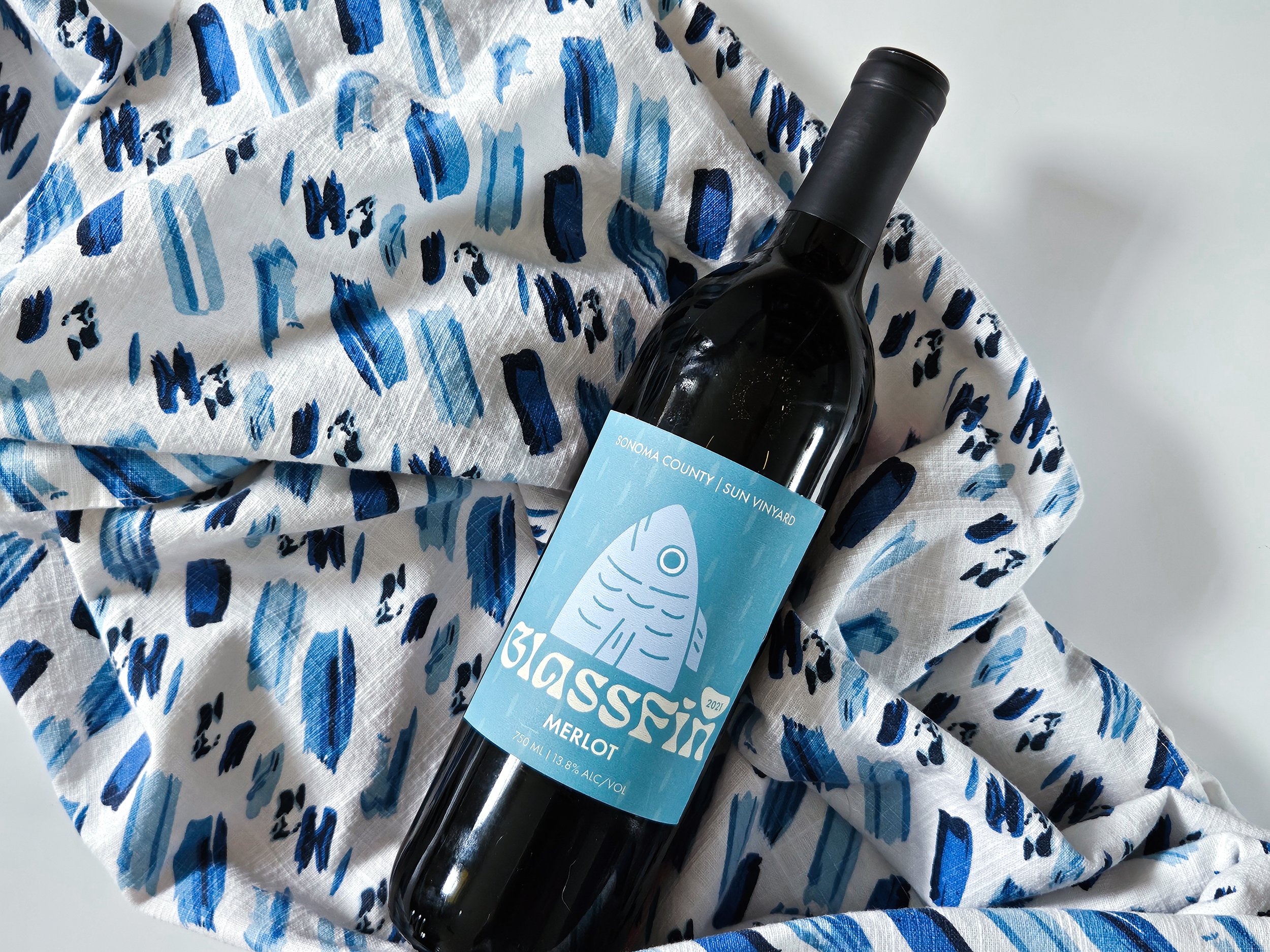
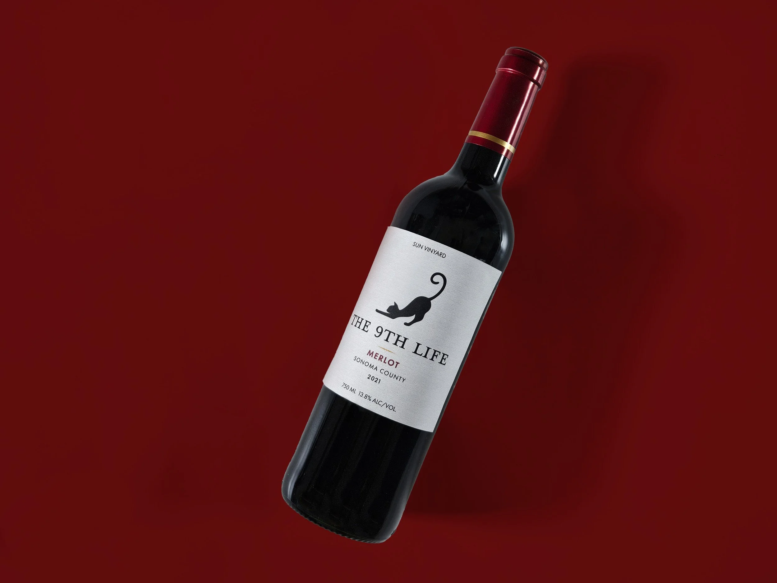
Informed by research on existing wine packaging, each label explores a distinct visual tone. The high-end label, The 9th Life, features a refined black cat illustration with its tail forming the number nine. The mid-range design takes a modern and approachable direction through the use of a playful fish illustration, while the low-end label embraces humor with a lighthearted goose character.
Together, the series demonstrates how illustration style, typography, and visual complexity can shift to appeal to different audiences while maintaining a cohesive and engaging design approach.
Other Works
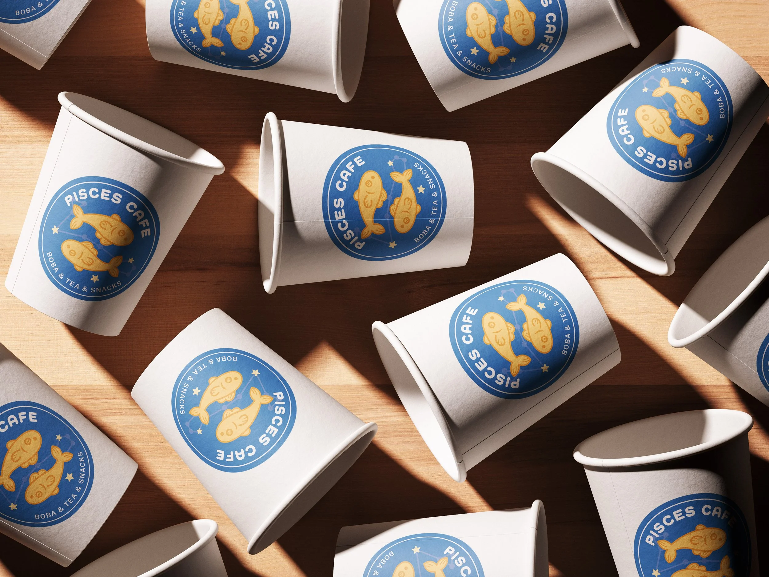
Pisces Cafe

Foodies Diary
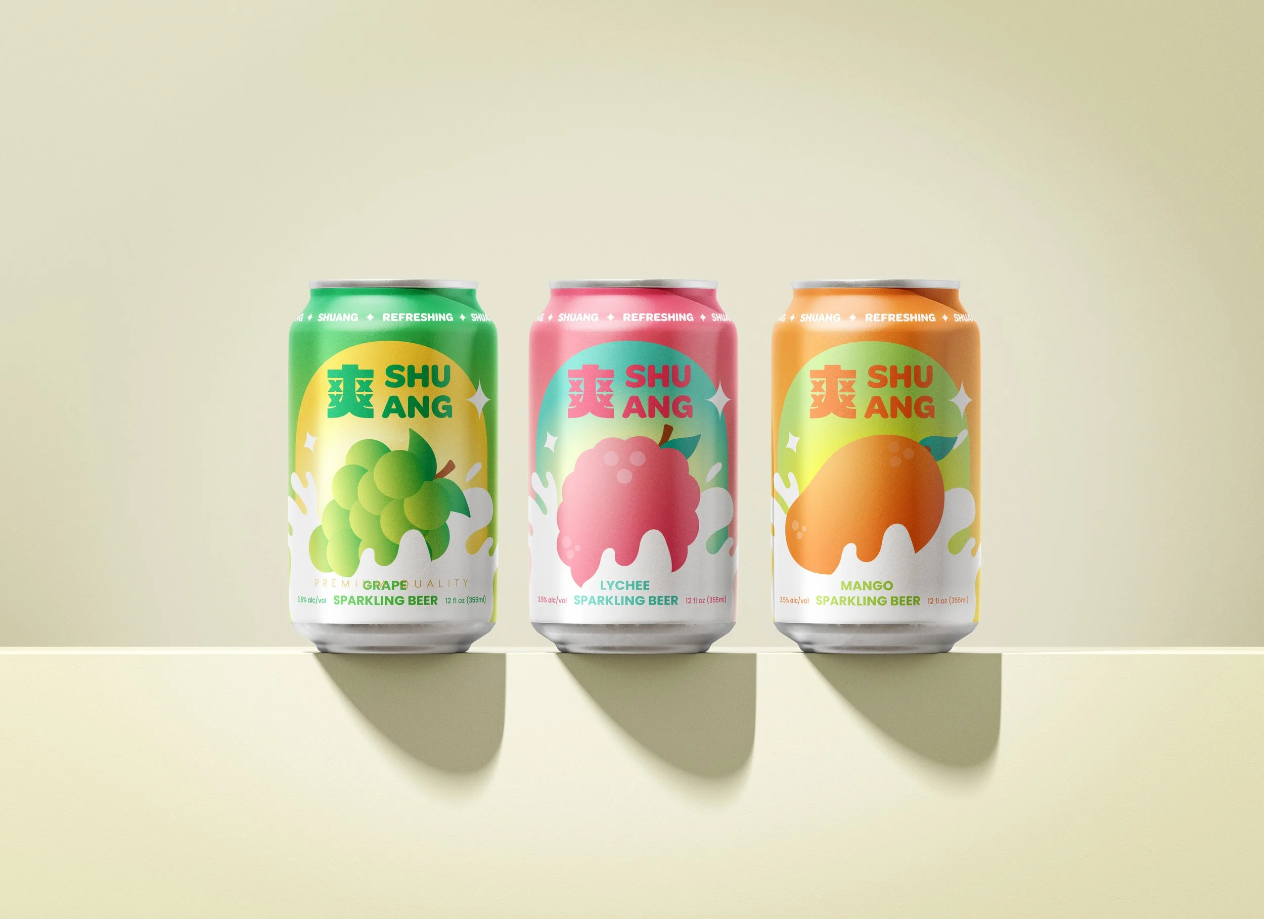
SHUANG